
Let's learn CSS Flexbox the easy way!
One Directional display CSS property : Flexbox


We all know how it is difficult is positioning an element in CSS. So to help us, we have majorly two display property, one is Flexbox and the other is Grid.
In this Blog, we would be learning Flexbox the easy way.
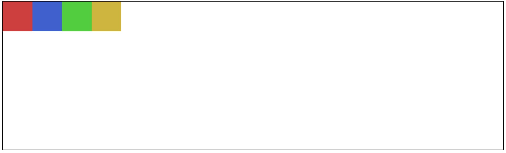
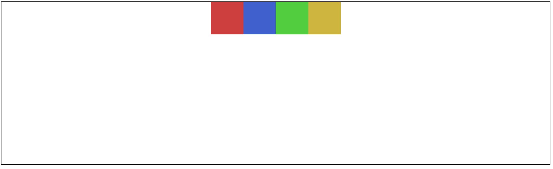
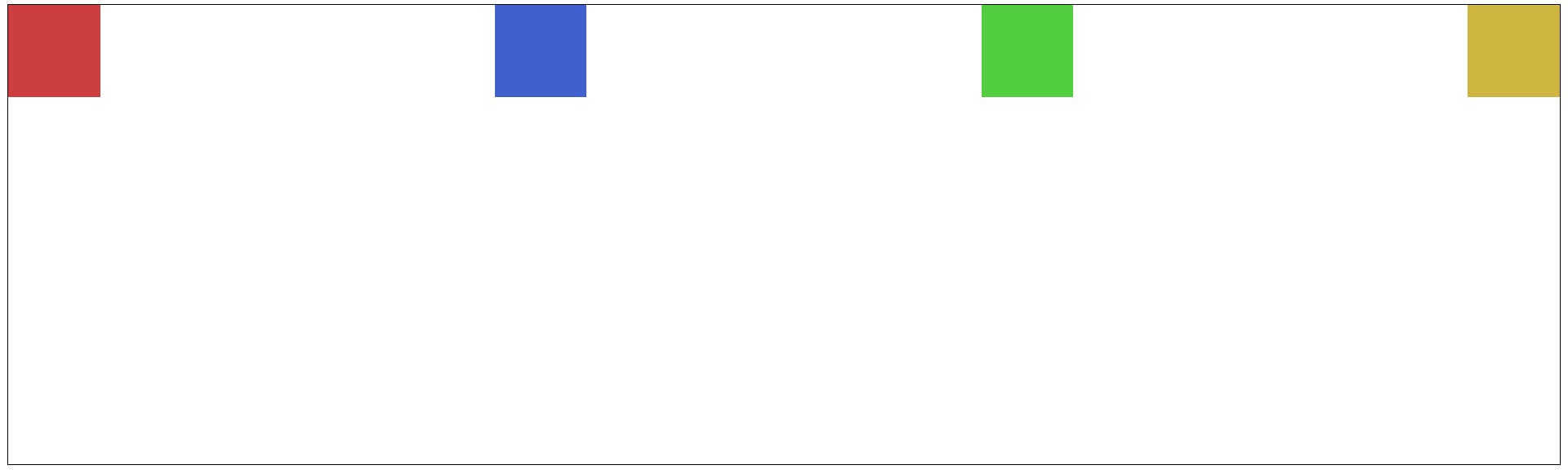
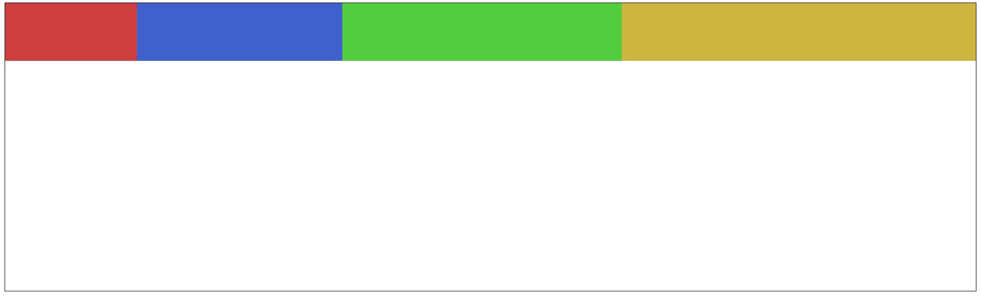
We have declared a parent div element and inside that, we have 4 child elements which are red, blue, green and yellow.
<div class="cont">
        <div class="container">
            <div class="cont1"></div>
            <div class="cont2"></div>
            <div class="cont3"></div>
            <div class="cont4"></div>
        </div>
</div>
.cont1 {
    height: 100px;
    width: 100px;
    background-color: rgb(205, 63, 63);
}

.cont2 {
    height: 100px;
    width: 100px;
    background-color: rgb(63, 96, 205);
}

.cont3 {
    height: 100px;
    width: 100px;
    background-color: rgb(82, 205, 63);
}

.cont4 {
    height: 100px;
    width: 100px;
    background-color: rgb(205, 181, 63);
}

.container {
    border: 1px solid black;
    height: 300px;

    display: flex;
    /*Here we will be writing the flex properties*/
}
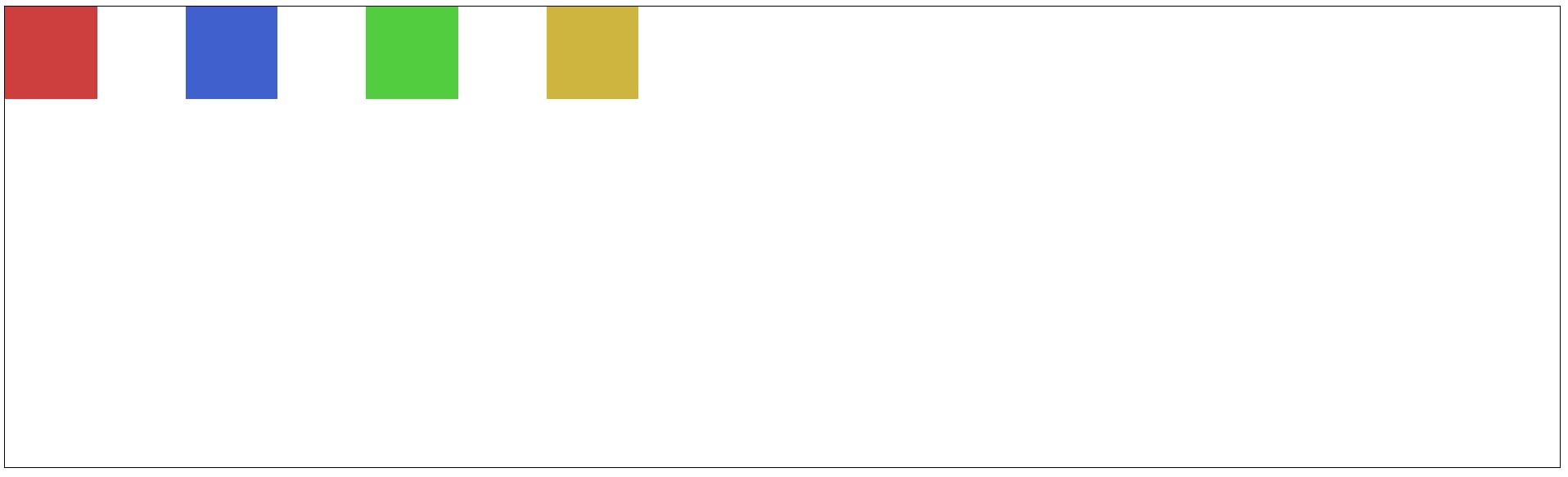
Parent Element Flexbox properties:-
Keep the display of the parent element as a flex display: flex;
flex-direction
It is used to declare main axis either row or column
It can be either row or a column. By default it is row.
display: flex;
flex-direction: row;
flex-direction: column;
The axes used in Flex Box are the Main Axis and Cross Axis.
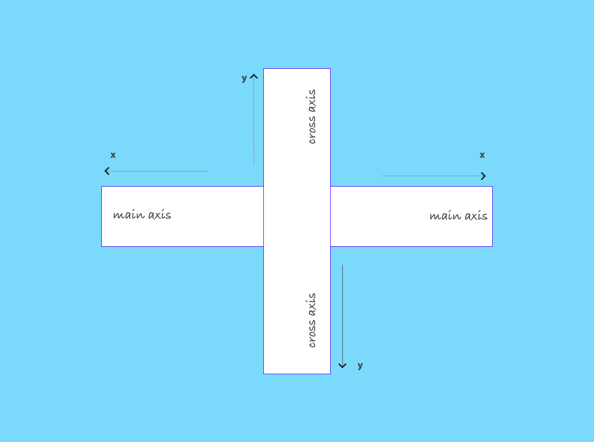
We will be now exploring two properties: justify-content(which works on main axis) and align-items(which works on cross axis).
Our assumption in this tutorial would be keeping flex-direction as row.
justify-content
It is used to align the items along the main axis.
justify-content: flex-start;
justify-content: center;
justify-content: space-between;
You can try out them.
justify-content: space-around;
justify-content: space-evenly;
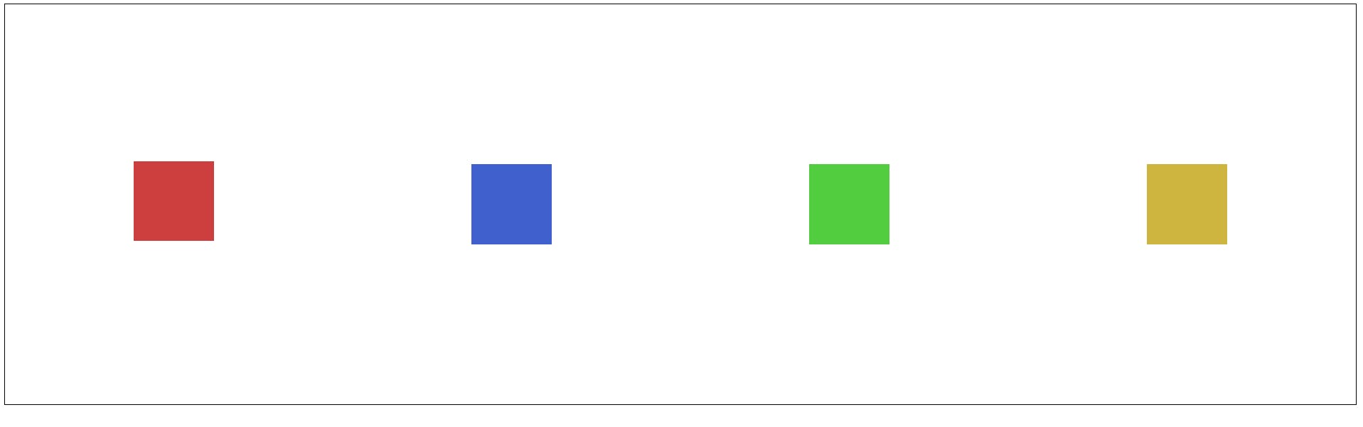
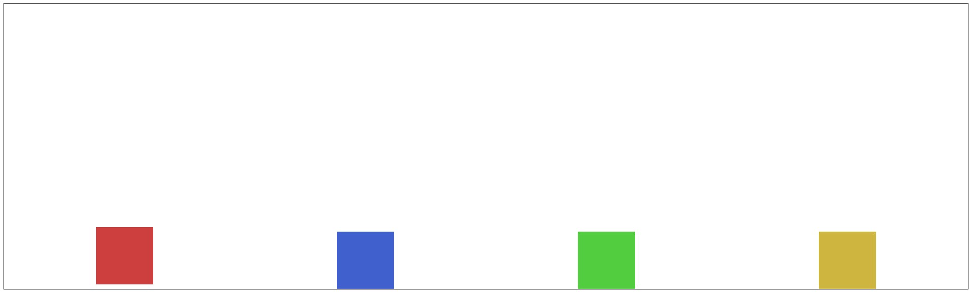
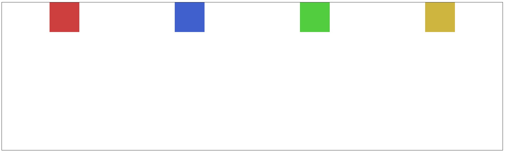
align-items
It is used to align the items along the cross axis.Our assumption would be assuming keeping justify-content: space-around;
align-items: center;
align-items: flex-end;
align-items: baseline;
wrap
It is used to maintain the size as it is while minimizing the size of the screen instead of items shrinking its size.
flex-wrap: wrap;
align-content
It is used to style the elements when flex-wrap: wrap; is active. It is similar to justify-content.
align-content: flex-end;
align-content: flex-start;
align-content: center;
align-content: space-around;
align-content: space-evenly;
align-content: space-between;
gap
It is used to give margin to the items of the parent container.
gap: 6rem;
Child Element Flexbox properties:-
We would be applying these property in the child container.
.cont1{
    height: 100px;
    width: 100px;
    margin-bottom: 0.5rem;
    background-color: rgb(205, 63, 63);
    /*Here we will be writing the flex properties*/
}
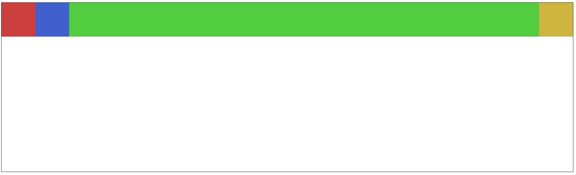
flex-grow
It is used to fill the entire main axis using a child element. It uses a fractional way of managing the size.
.cont1 {
    height: 100px;
    width: 100px;
    margin-bottom: 0.5rem;
    background-color: rgb(205, 63, 63);
    flex-grow: 1;
}

.cont2 {
    height: 100px;
    width: 100px;
    background-color: rgb(63, 96, 205);
    flex-grow: 2;
}

.cont3 {
    height: 100px;
    width: 100px;
    background-color: rgb(82, 205, 63);
    flex-grow: 3;
}

.cont4 {
    height: 100px;
    width: 100px;
    background-color: rgb(205, 181, 63);
    flex-grow: 4;
}
flex-shrink
It is used to maintain the speed of the items shrinking when the size of screen shrinks. It is used in responsive designs. It uses a fractional way of managing the speed.
flex-shrink: 3;
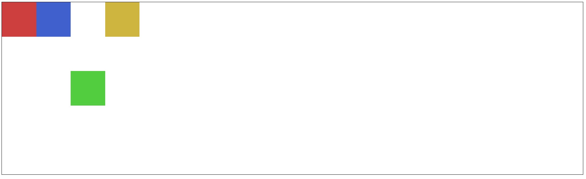
flex-basis
It is used to give width to a particular element.
.cont3 {
    height: 100px;
    width: 100px;
    background-color: rgb(82, 205, 63);
    flex-basis: 500px;
}

flex
It is a shorthand for flex-grow flex-shrink flex-basis.
.cont3 {
    height: 100px;
    width: 100px;
    background-color: rgb(82, 205, 63);
    flex: 1 0 0;
}
align-self
It overrides the preset align-items and works upon the given position (center; flex-start; flex-end;
.cont3 {
    height: 100px;
    width: 100px;
    background-color: rgb(82, 205, 63);
    align-self: center;
}
Voila! You have learnt Flexbox in the best possible way and I have tried to cover all the important properties so that you can start away work with them on your next project.